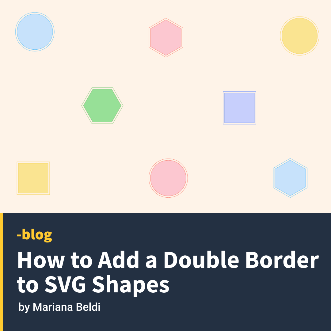
Let’s say someone asks you to add a double border to some random geometric SVG shapes. For some reason, you can’t use any graphic editor — they need to be generated at runtime — so you have to solve it with CSS or within the SVG syntax.
Your first question might be: Is there anything like stroke-style: double in SVG? Well, the answer is not yet and it’s not that easy. But I’ll attempt it anyway to see what methods I can uncover. I’ll explore the possibilities of three different basic shapes: circle, rectangle, and polygon. Pointing the ones that can keep a transparent color in the middle of the two lines.
Spoiler alert: all the results have their downsides, at least with CSS and SVG, but let me walk you through my intents.
The simple solutions
These don’t work with all shapes, but they are the easiest of the solutions.
outline and box-shadow
The CSS properties outline and box-shadow only apply to the bounding box of the shape or SVG, and so both are great solutions only for squares and rectangles. They also allow flexible colors using custom properties.
It only takes two lines of CSS with outline, plus it keeps the background color visible through the shape.
- 🙁 Solution only for one shape.
- ✅ Simple code
- ✅ Borders are smooth
- ✅ Transparent background
box-shadow only needs one line of CSS, but we have to make sure that each shape has its own SVG as we can’t apply box-shadow directly to the shapes. Another thing to consider is that we have to apply the color of the background in the declaration.
- 🙁 Solution only for one shape
- ✅ Simple code
- ✅ Borders are smooth
- 🙁 No transparent background
SVG gradients
SVG radial gradients only work on circles ☺️. We can directly apply the gradient on the stroke, but it’s better to use variables as we have to declare the colors many times in the code.
- 🙁 Solution only for one shape
- ✅ Simple code
- 🙁 Borders are smooth
- 🙁 No transparent background
Solutions for all shapes
These will work with all shapes, but the code could become bloated or complex.
filter: drop-shadow()
Finally, one solution for all shapes! We must have each shape in its own <svg> since the filter won’t apply directly to the shapes. We are using one declaration in CSS and have flexible colors using variables. The downside? The borders don’t look very smooth.
- ✅ One solution for all shapes
- ✅ Simple code
- 🙁 Borders look pixelated
- 🙁 No transparent background
SVG filters
This is a very flexible solution. We can create a filter and add it to the shapes through SVG’s filter attribute. The complicated part here is the filter itself. We’ll need three paintings, one for the outside border, one for the background flood, and the last one to paint the shape on the front. The result looks better than using drop-shadow, but the borders are still pixelated.
- ✅ One solution for all shapes
- 🙁 Complex code
- 🙁 Borders look pixelated
- 🙁 No transparent background
Reusing shapes
There are a couple of possible options here.
Option 1: Transforms
This solution requires transforms. We place one figure over the other, where the main figure has a fill color and a stroke color, and the other figure has no fill, a red stroke, and is scaled and repositioned to the center. We defined our shapes on the <defs>. The trick is to translate half of the viewBox to the negative space so that, when we scale them, we can do it from the center of the figure.
- ✅ One solution for all shapes
- 🙁 Duplicated code
- ✅ Borders are smooth
- ✅ Transparent background
Option 2:
I found a clever solution in the www-svg mailing list by Doug Schepers that uses SVG <use>. Again, it requires defining the shapes once and referring to them twice using <use>. This time the main shape has a bigger stroke. The second shape has half the stroke of the main shape, no fill, and a stroke matching the background color.
- ✅ One solution for all shapes
- 🙁 Duplicated code
- ✅ Borders are smooth
- 🙁 No transparent background
Here are the full results!
Just so you have them all in one place. Let me know if you can think of other possible solutions!


