Nerdearla is an annual conference with talks and workshops about technology and science here in Buenos Aires.
As sponsors of the event with Leniolabs, we used to have a stand where people could come by and say hi, play games with us, talk about technologies we love, and get some of our alien merch. It was the perfect excuse to get to know each other in this community.

Then the pandemic changed everything. And the event as we knew it was not possible anymore. They resolved to make this last edition online, so we decided to build a site to still be able to interact with people and play the games we’ve been developing. We didn’t know what to expect. Trying to keep closer in the distance was a challenge for us. But at the same time, there was a bigger audience to connect to, as many speakers and attendees could be present from any part of the world.
We first attempted to create an interactive city to chat in bars or share articles in the library, talk in the theatres, or play games in the park. But all those places seemed far away from our reality at that moment.

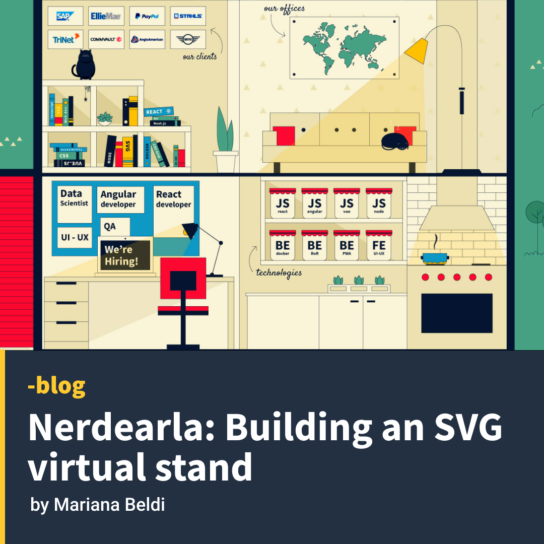
Then the popular #stayathome hashtag hit us: why not illustrate our own house at Leniolabs?
Each room would refer to one area of the company; we had our videos of workshops and talks in the garage, our blog posts in the home library, the live chat in the living room, the games in the garden, the trivia challenges in the loft, our lab in the basement, the Bootcamp we were cooking at the kitchen, and the job section in the office room. And everyone was invited; we wanted to share what happens inside Leniolabs, our internal workshops, and articles we write to share our knowledge.

Coding the design and making it responsive
There was a challenge to make this website mobile-friendly as the whole site was a big illustration. After playing around with different approaches, we decided to use Layoutit to build a CSS Grid. We exported every room as a single SVG and made every SVG a component. Then we created a grid where every grid item was one of these components. We changed the layout and the position of the grid areas depending on the screen size, going from 4 column layout on large screens to a single column on mobile.

The technology used
We chose Nuxt as we needed a site that would last 5 days but with one month to build it from scratch. No time was lost in router configuration, auto imported components, and a nice folder structure in a pre-rendered site. And we chose Netlify as we needed to iterate and share the results often. A free, serverless platform to push and deploy.
CSS animations
We used some small animations on hover to make the house a little bit more alive—all with preferred reduce-motion for accessibility.


Night mode and easter eggs
After a certain hour, the house switches off, some of the lights are out, and others are on. The sleeping cat is now catching a spider; Leni (our alien mascot) falls asleep outside the house. We love the idea that the more you visit the site, the more details you’ll find hidden. Every SVG is a reusable component that appears on each internal page and changes as the dark mode turns on.


Between 4 pm and 7 am, this function adds a class to the container of the site to activate the dark mode:
<template>
 <div :class="{ night: isDark }">
 ...
</template>
<script>
 export default {
  data() {
   return { isDark: false };
  },
 methods: {
  updateTime() {
   if (process.client) {
    const hours = new Date().getHours();
    this.isDark = hours < 7 || hours > 16;
   }
  },
 },
...
</script>
This ended up being our official event site for Nerdearla, as they will continue doing it online and we are part of the 2021 edition from 20 to 23rd of October. We will be hosting games and sending gifts to everyone who will join us this year! But even if you don’t join the conference you can still visit our virtual stand at https://nerdearla.leniolabs.com
More details about the making of the site are in this talk (Spanish version):


