

Typography is one of the foundations of design in general, and UX/UI is no exception. In this blog post, we will explore key typography principles that can influence the user experience and how to use them in your favor, not only to create visually appealing interfaces but also to enhance usability.
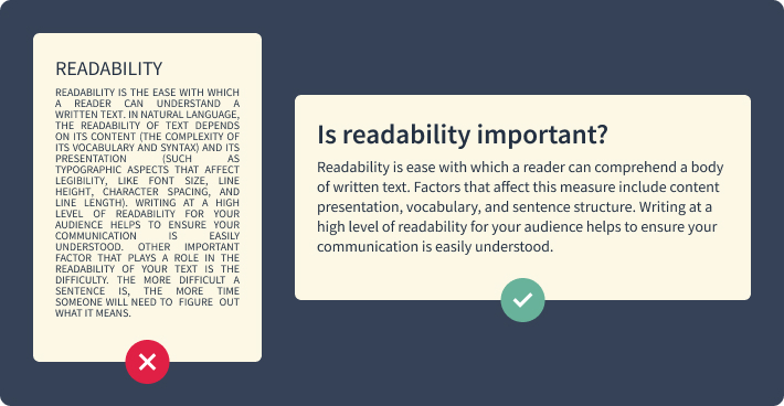
Readability:
Ensuring your text is easy to read is essential for a positive user experience. Choose legible fonts that are clear and easily distinguishable, and consider the context and purpose of your design in order to select fonts that align with the content and target audience. Remember to pay attention to the length of your text line. In general, 45 to 70 characters is the ideal line length for website text. In addition, left-aligned text is the most legible one. Try to avoid centering or justifying long paragraphs.
Hierarchy and Visual Hierarchy:
Typography can establish a hierarchy, guiding users’ attention and showing the ideal navigation through your interface. By manipulating font sizes, weights, and styles, you can create a clear visual hierarchy that highlights important information and establishes a logical flow of content. Emphasizing key elements through typography helps users understand the structure of your website and locate relevant information easily. Effective use of visual hierarchy improves navigation and helps the overall user understanding.

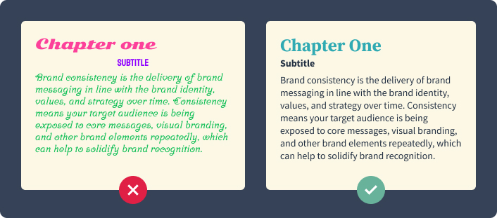
Consistency and Branding:
Maintaining consistency in typography across your user interface is essential for a cohesive and professional design. Consistent typography reinforces brand identity and recognition, helping users establish a connection between your design and your brand. Choose fonts that align with your brand’s personality and design guidelines. It is recommended to stick with one or two font families only. This will help to establish a strong visual identity and create a seamless user experience.
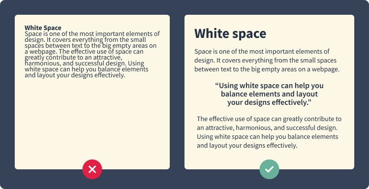
White Space and Typography:
White space, also known as negative space, plays a crucial role in typography. It refers to the space between elements and paragraphs, and it has a significant impact on legibility and readability. Leaving your elements and text room to breathe enhances visual clarity and improves the overall user experience, making your content easier to read and understand.
Responsive Typography:
In today’s multi-device world, you have to take responsive design into account. Typography needs to adapt seamlessly to different screen sizes and resolutions, and it can be challenging, but it is essential for an optimal user experience. Techniques such as using media queries and fluid typography allow you to ensure that your text adjusts appropriately across various devices. By prioritizing responsive typography, you provide a consistent and pleasant reading experience for your users, regardless of the device they are using.
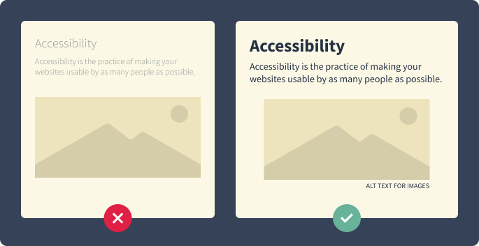
Accessibility Considerations:
Accessibility is another thing to consider while designing, and typography plays a significant role in creating accessible designs. Pay attention to font contrasts to ensure that text is easily readable for visually impaired users, and provide alternative text for typography used in images so that screen readers can process the information more accurately. Doing this makes your designs inclusive and accessible to a broader range of users.
Conclusion:
Typography is a powerful UX/UI Design tool, shaping the user experience and influencing how users interact with your interface. The key to successful typography use is a combination of thoughtful design choices and understanding your users’ needs. By prioritizing readability, establishing hierarchy, maintaining consistency, utilizing white space effectively, adapting typography responsively, and considering accessibility, you can create designs that are visually compelling, user-friendly, and have an impact. We hope this exploration of essential typographic principles empowers you to create exceptional user experiences through your designs.